To address critical issues of driver confusion, traffic flow, and pedestrian safety, I was commissioned to redesign the signage system for a large hospital parking garage. The existing layout suffered from poor directional cues, resulting in frequent wrong-way driving, bottlenecks, and increased risk for pedestrians—particularly vulnerable patients and staff navigating the facility on foot.
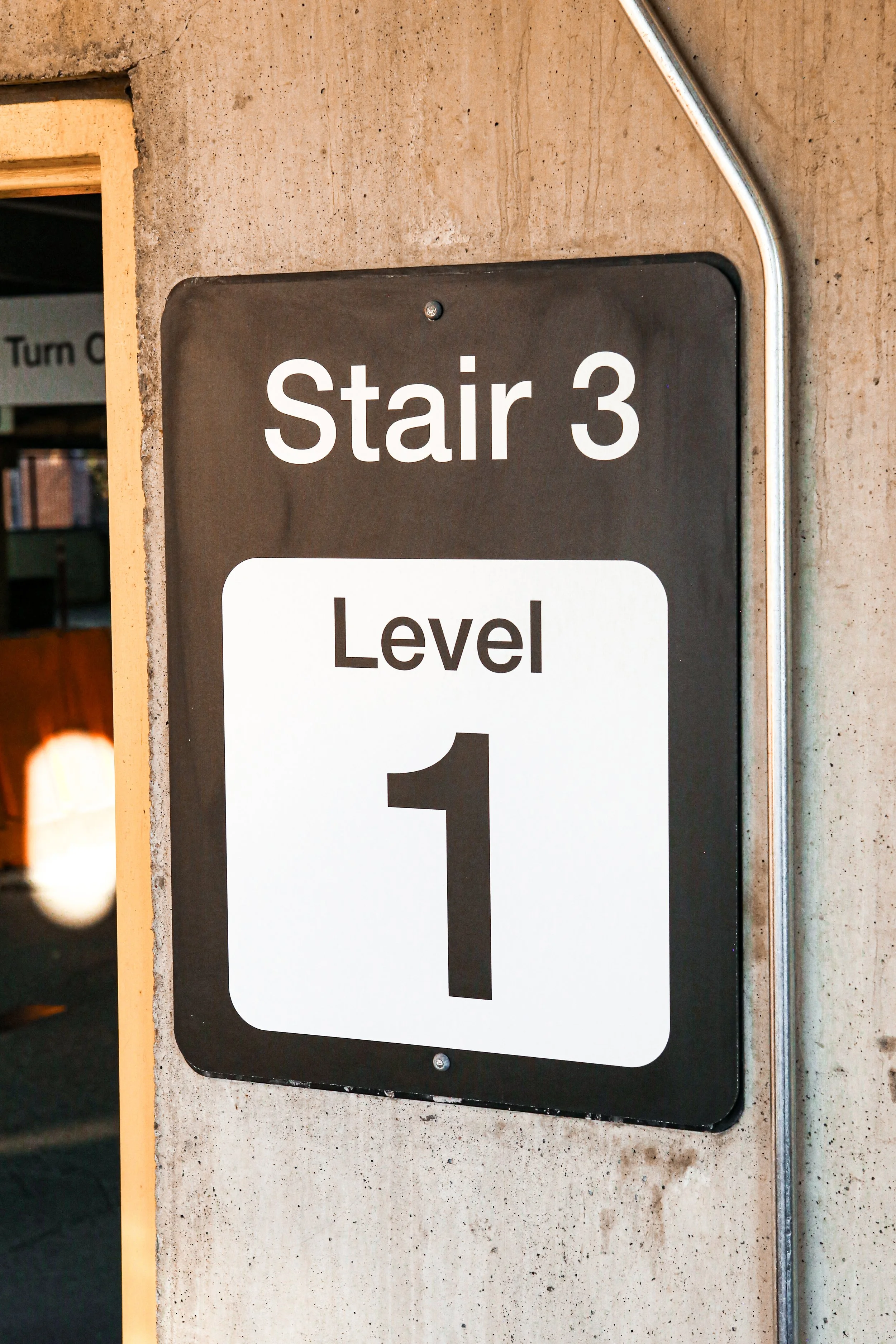
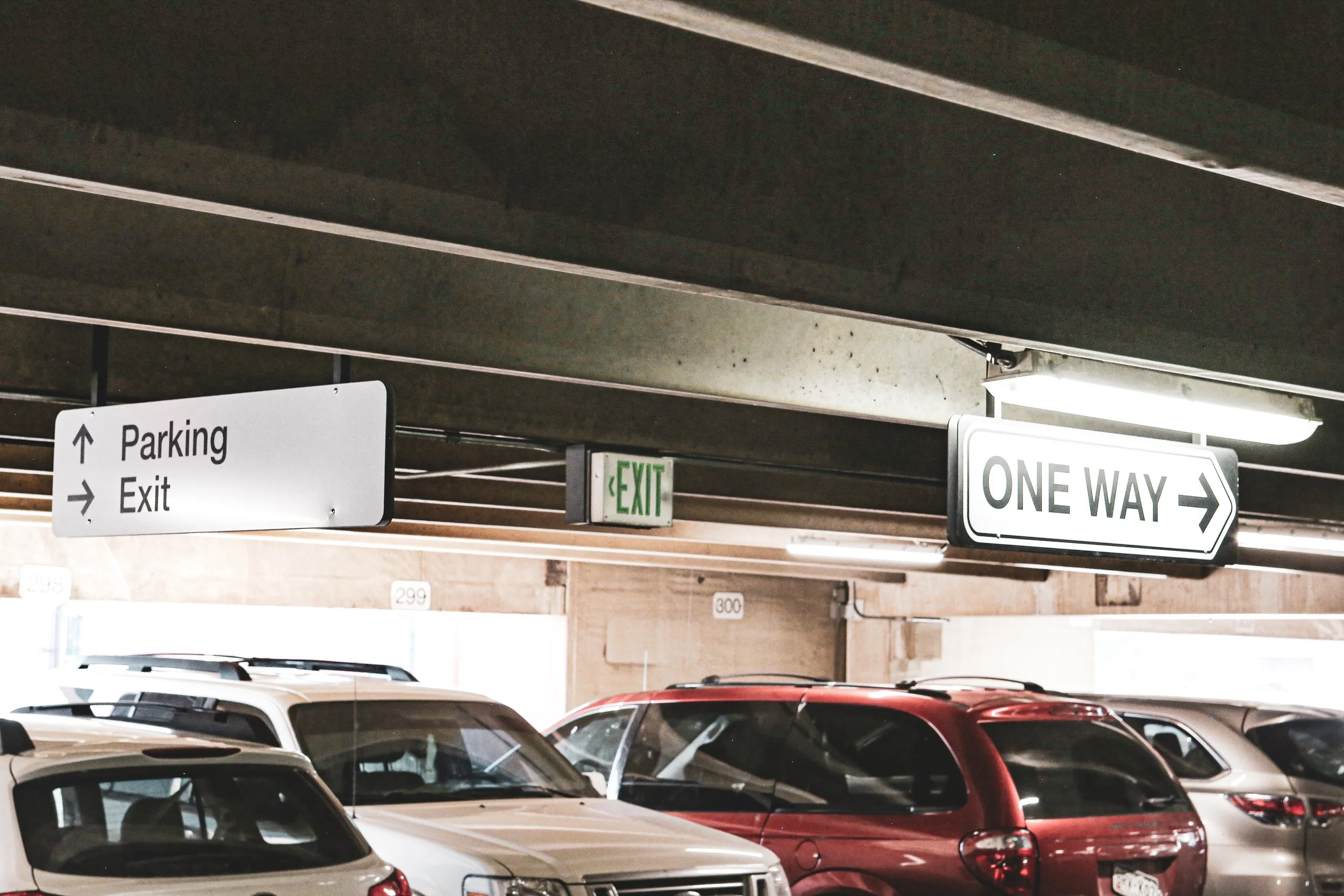
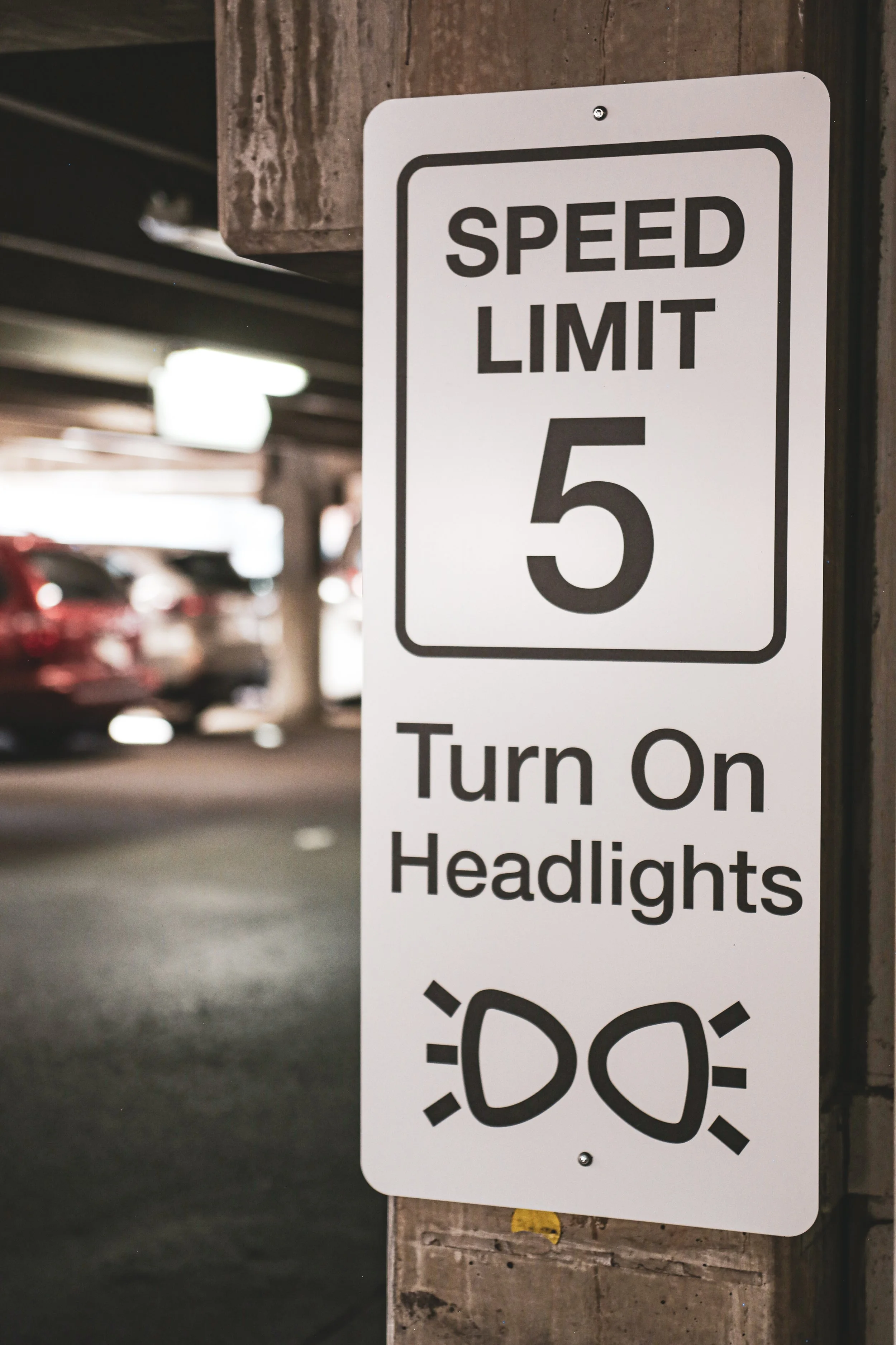
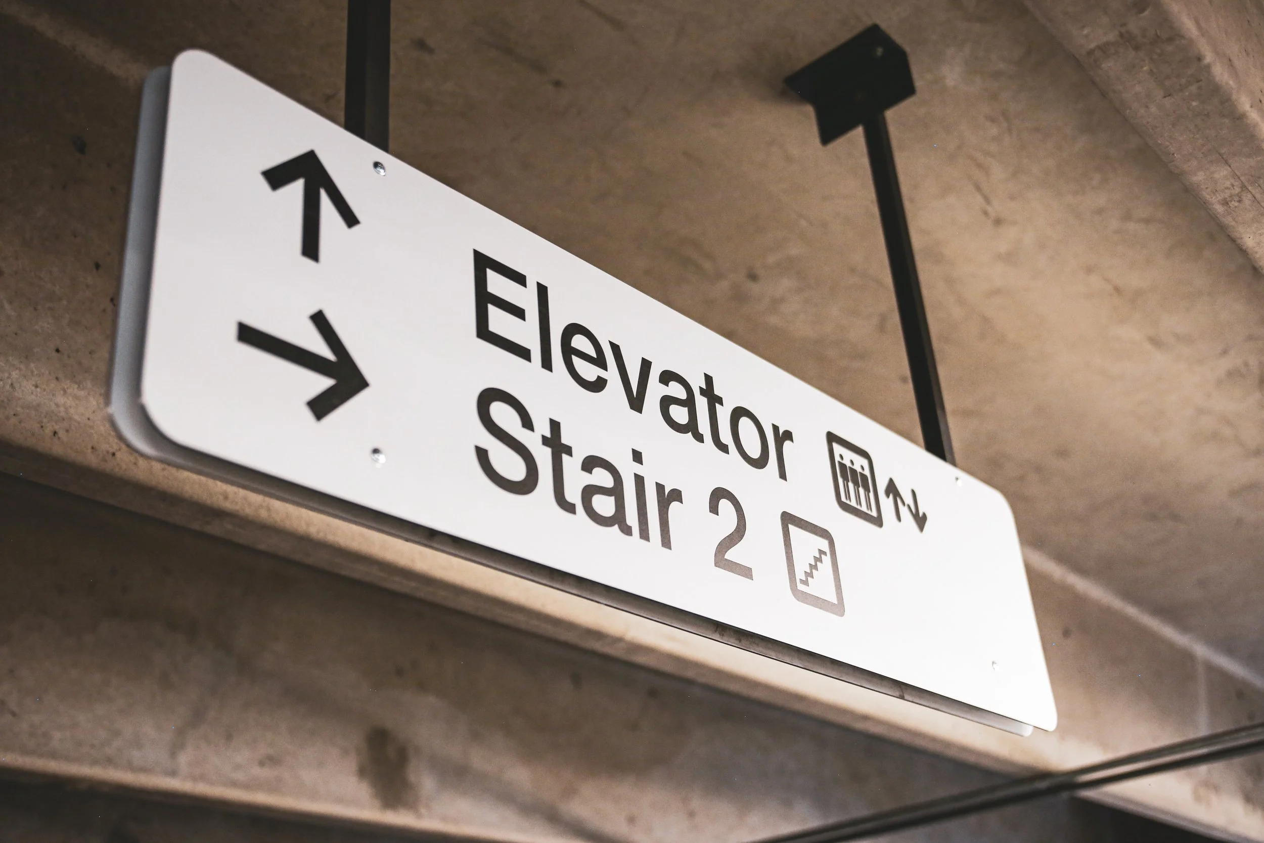
My approach centered on clarity, simplicity, and visibility. I developed a comprehensive wayfinding strategy, starting with a site audit to identify key decision points, blind spots, and conflict zones between vehicles and pedestrians. From there, I designed a new suite of signage that uses high-contrast typography, universally understood symbols, and clear directional language to guide drivers seamlessly through the multi-level structure.
The signage was fabricated with durable, weather-resistant materials and installed with careful attention to sightlines and lighting conditions. As a result, the new system significantly reduced confusion and improved traffic flow, creating a safer, more intuitive environment for patients, visitors, and staff alike.