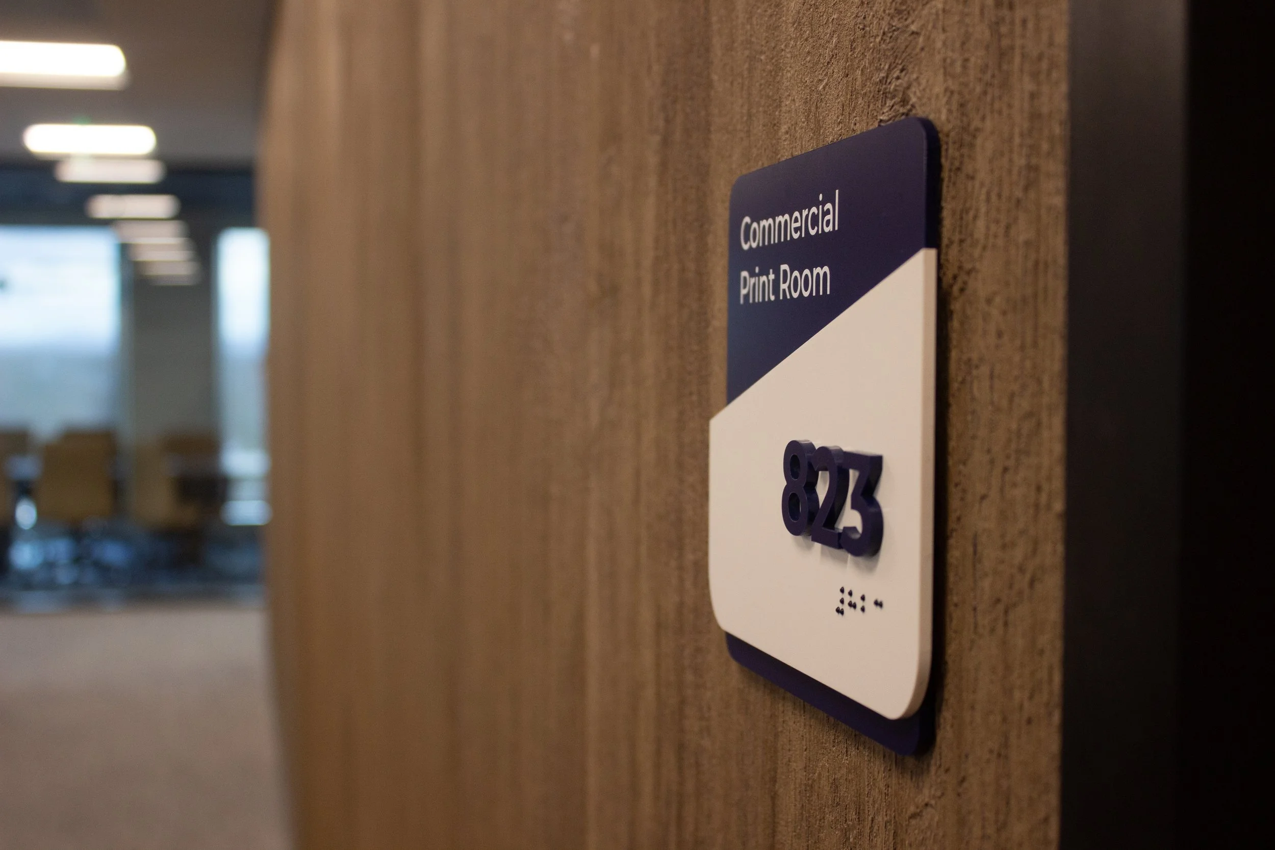
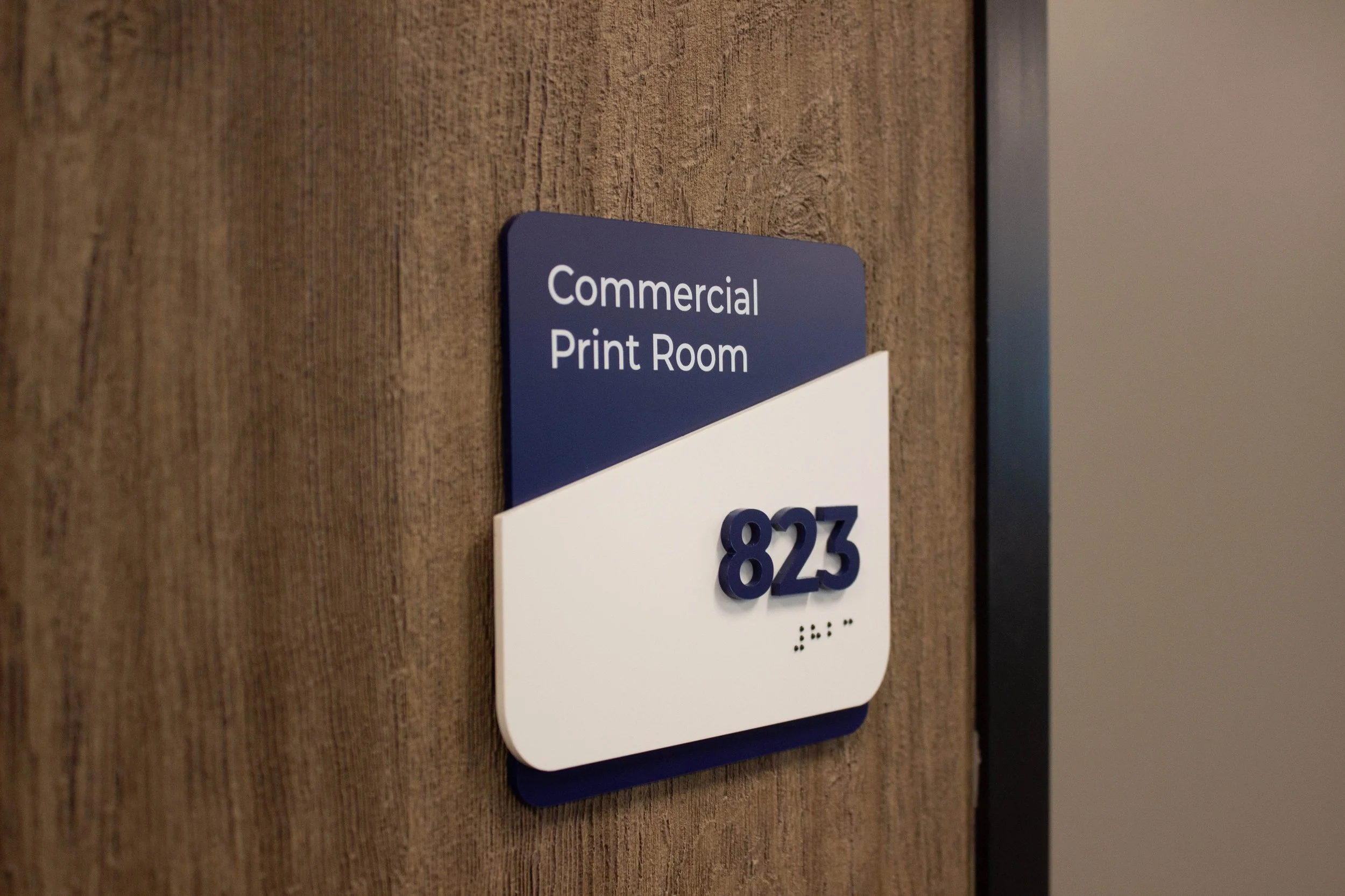
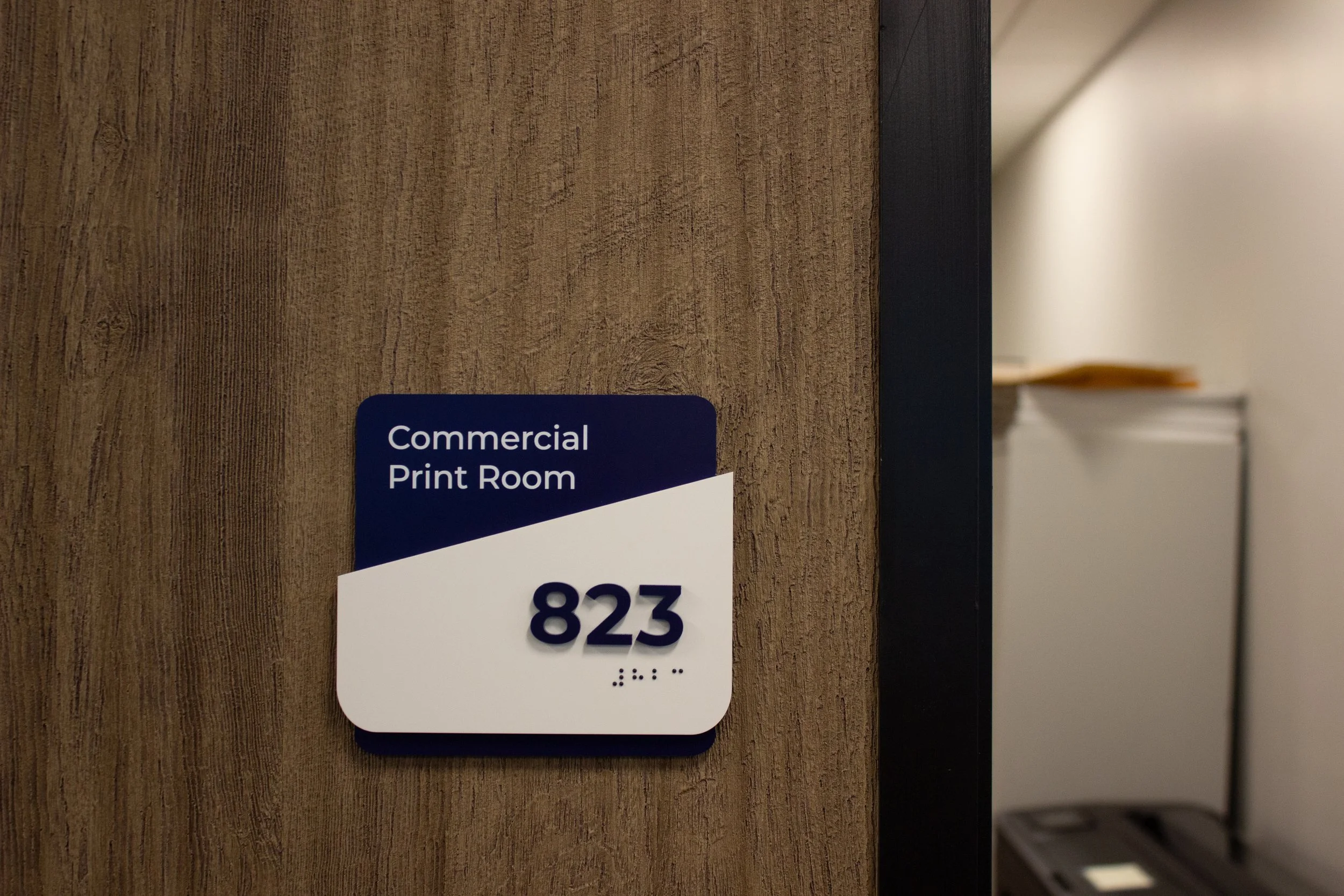
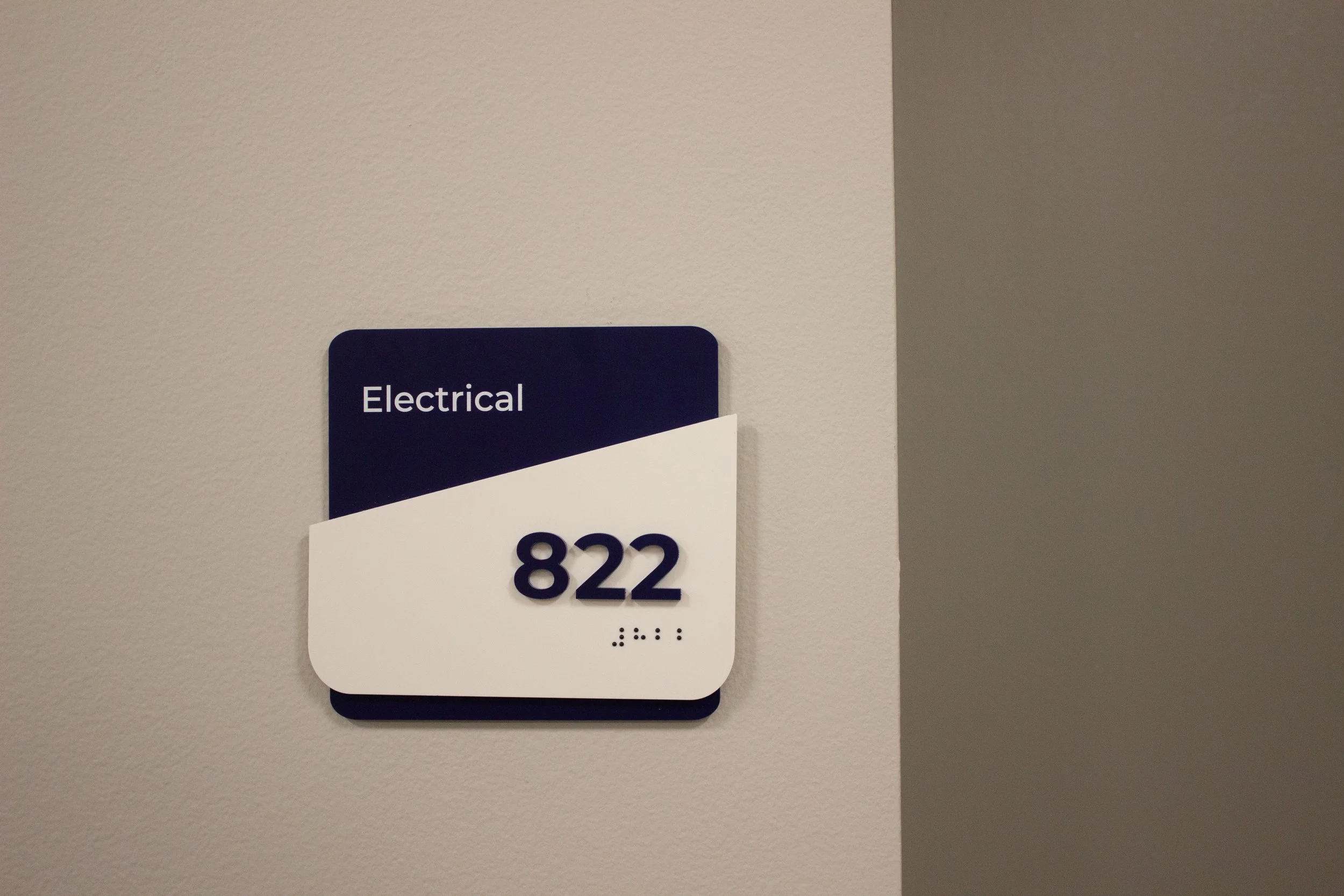
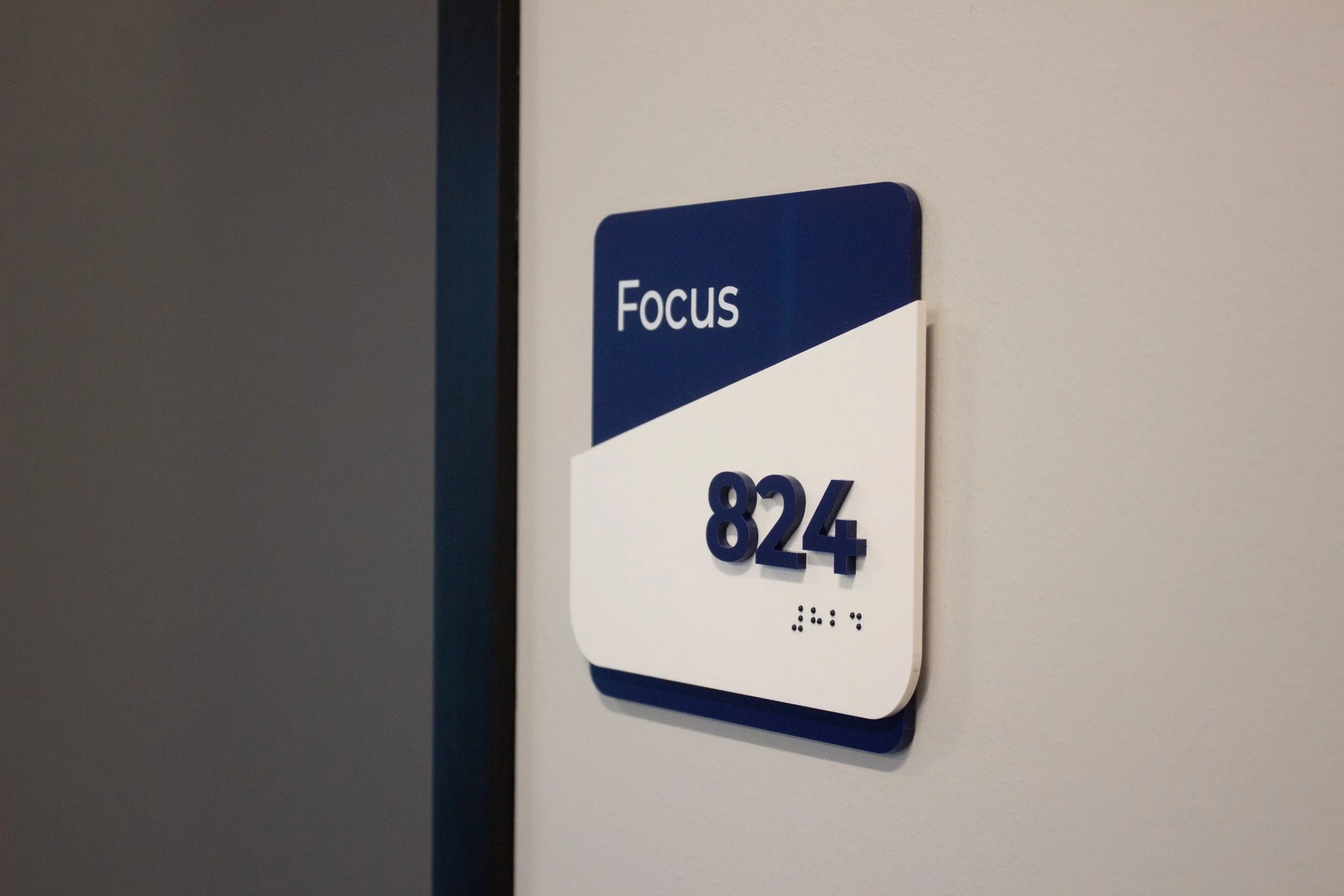
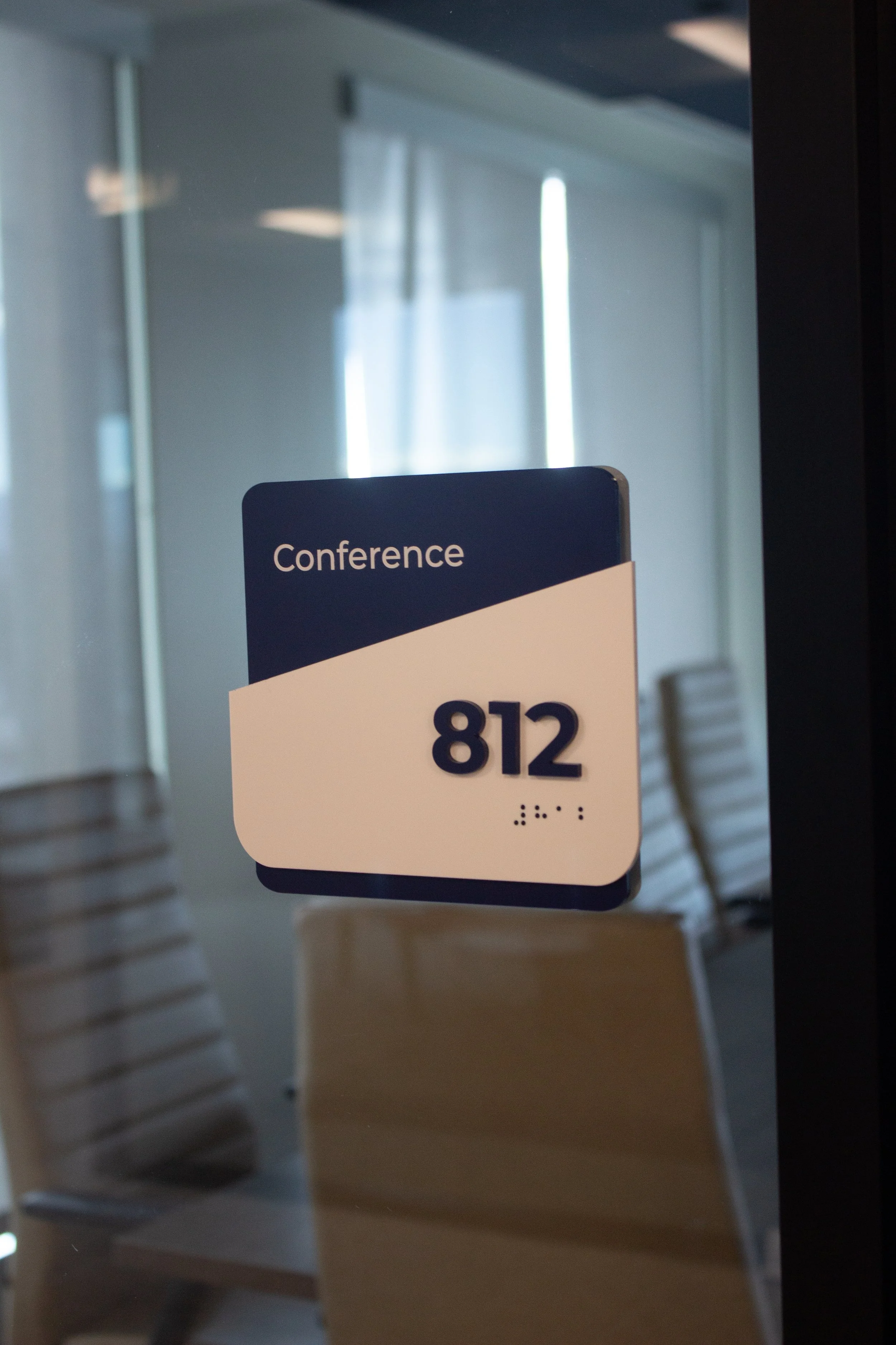
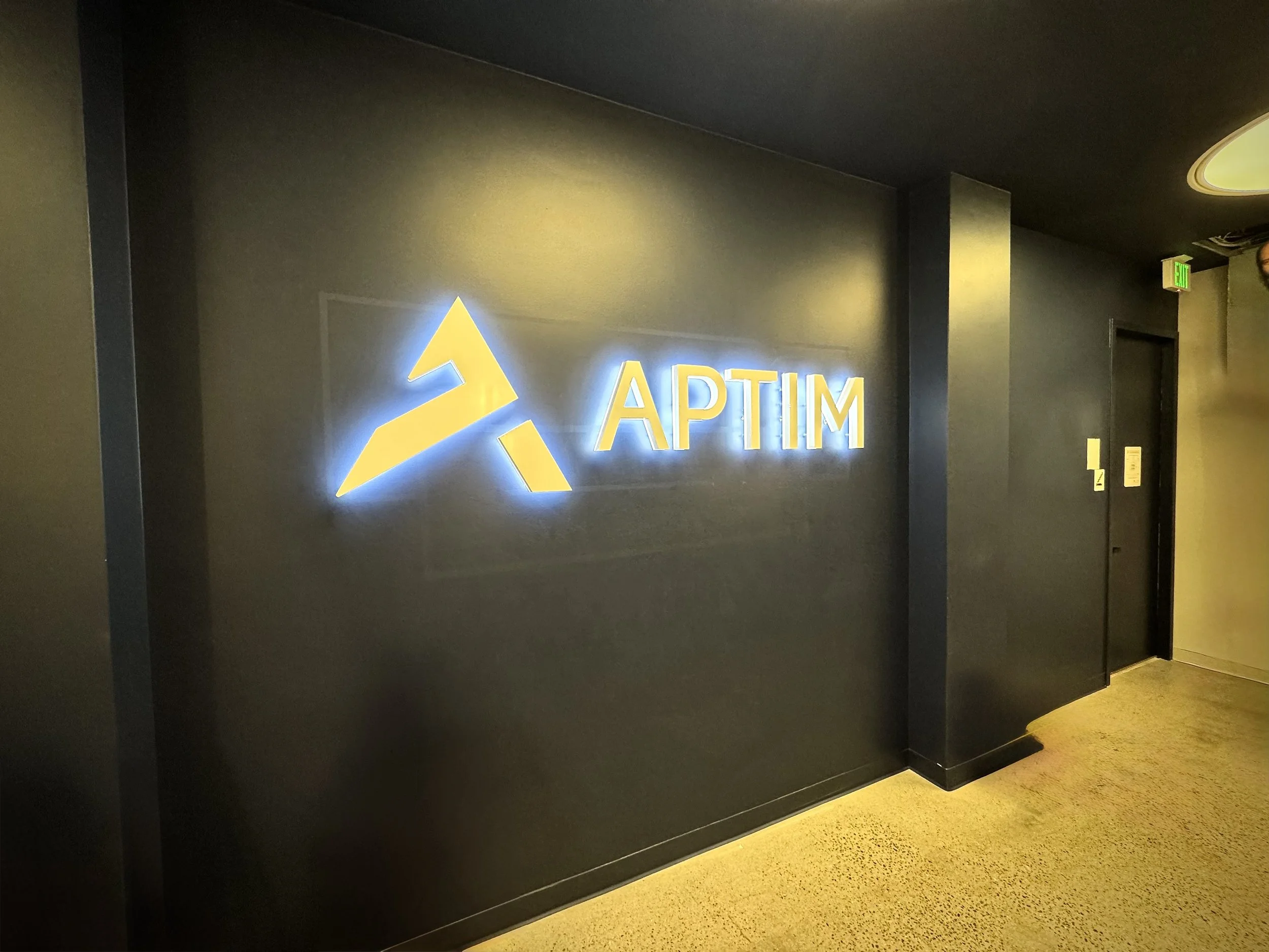
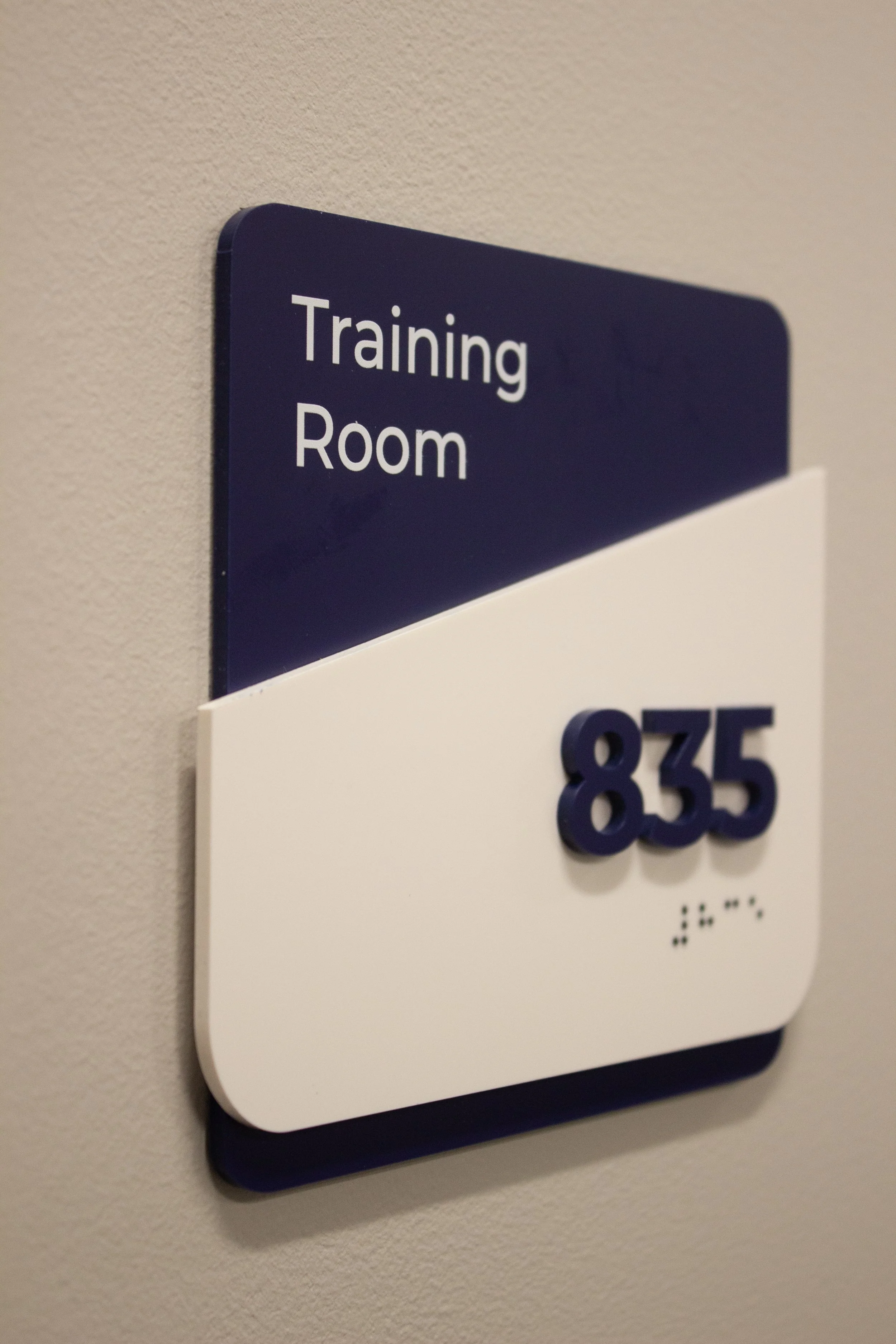
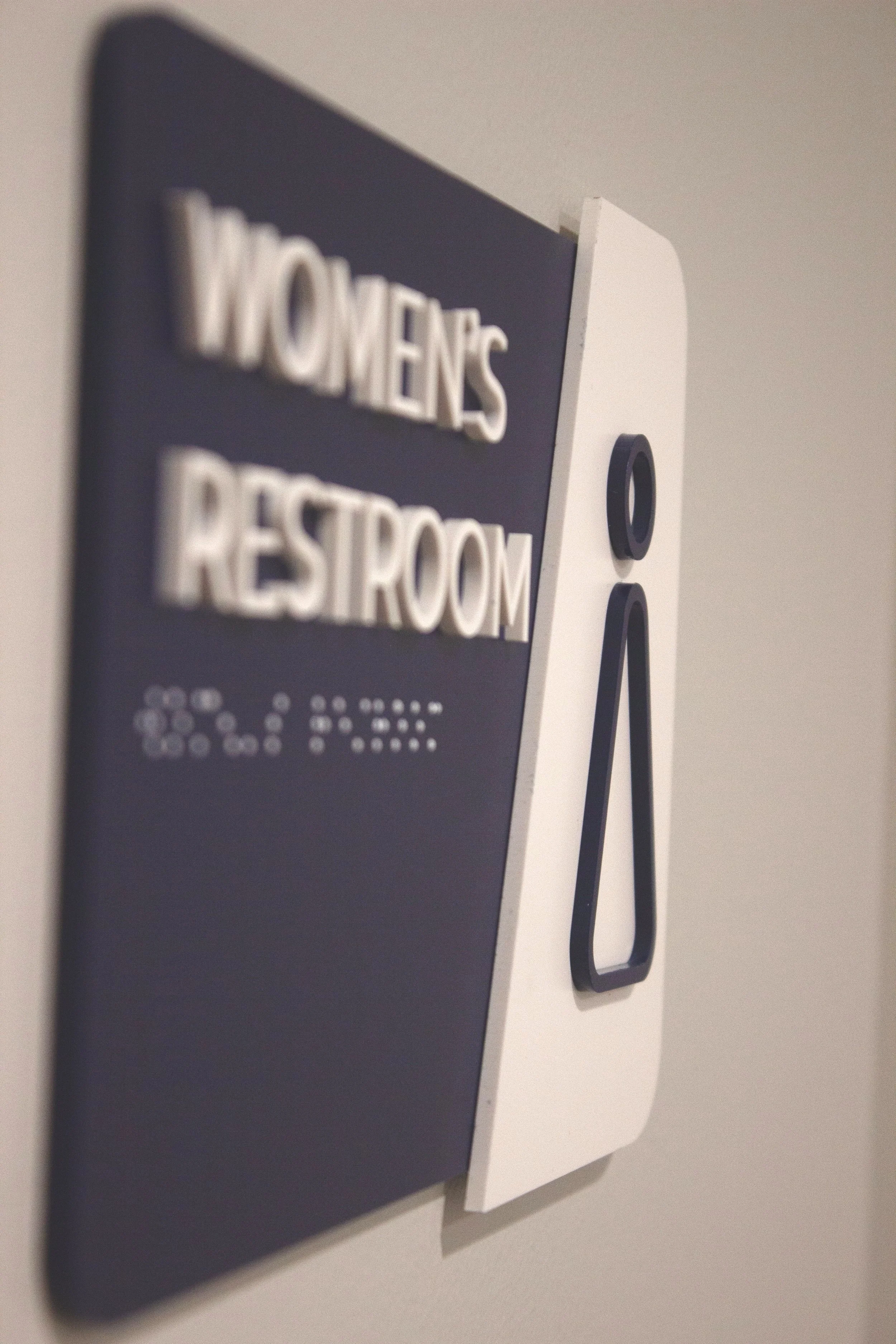
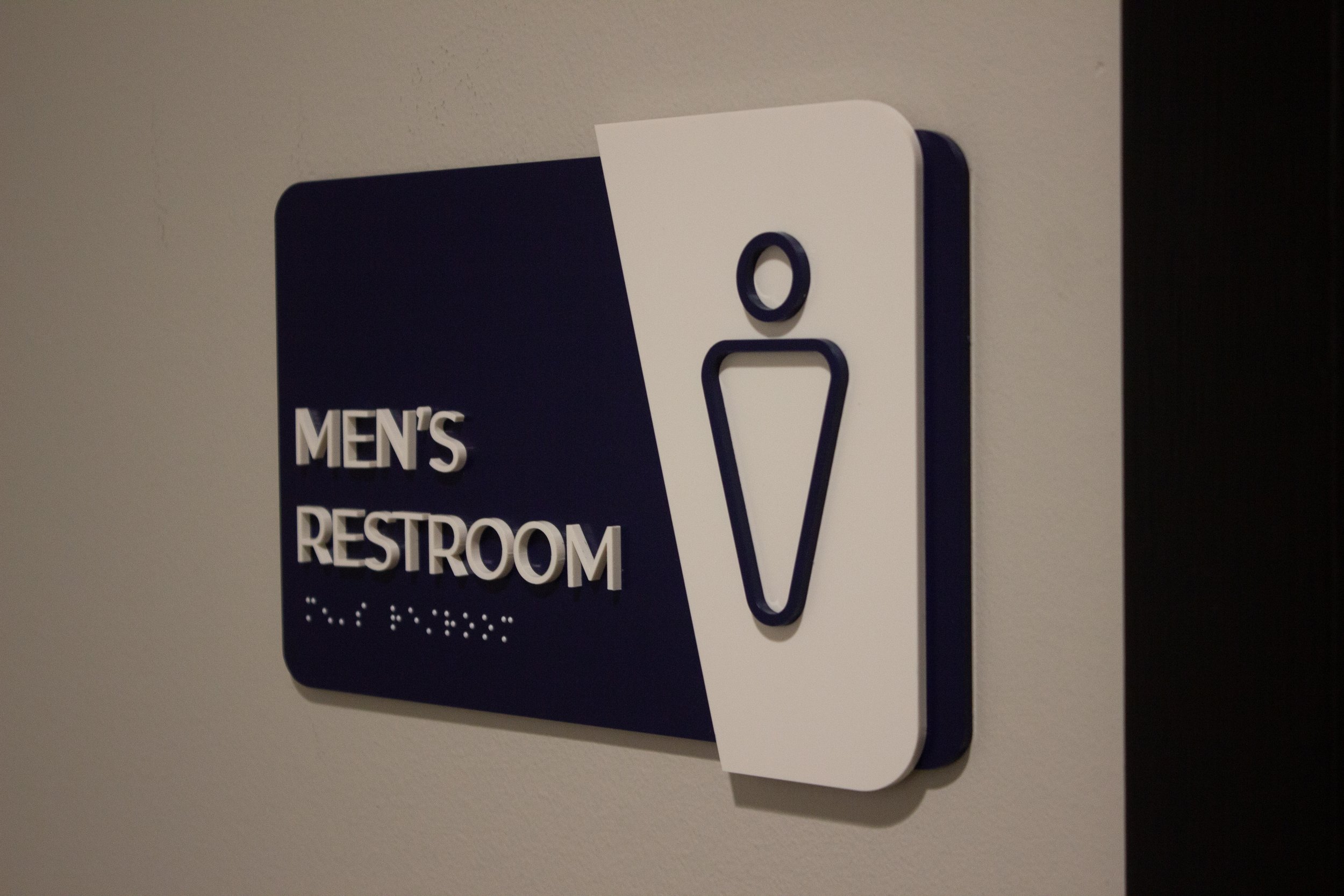
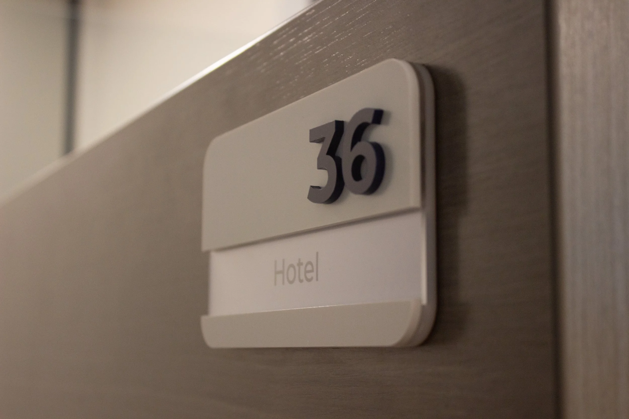
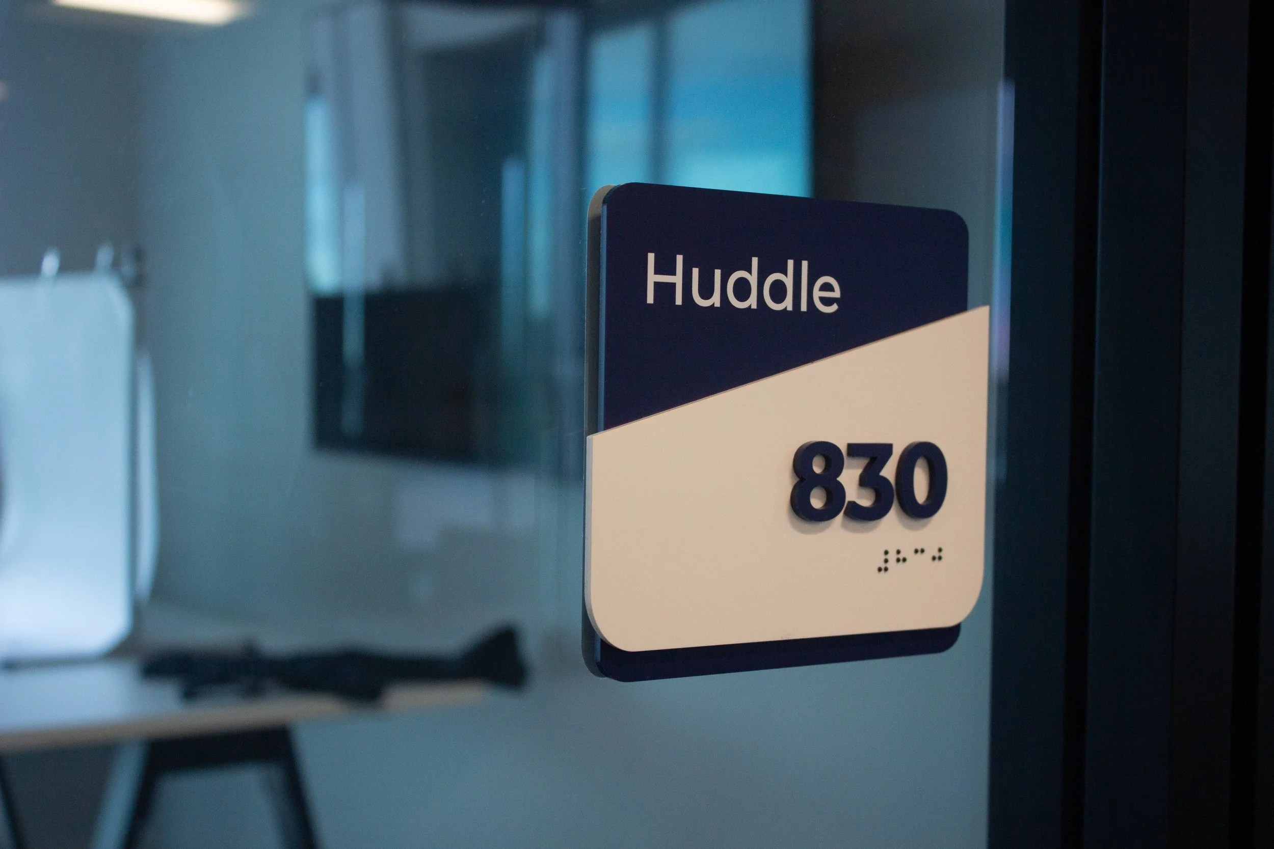
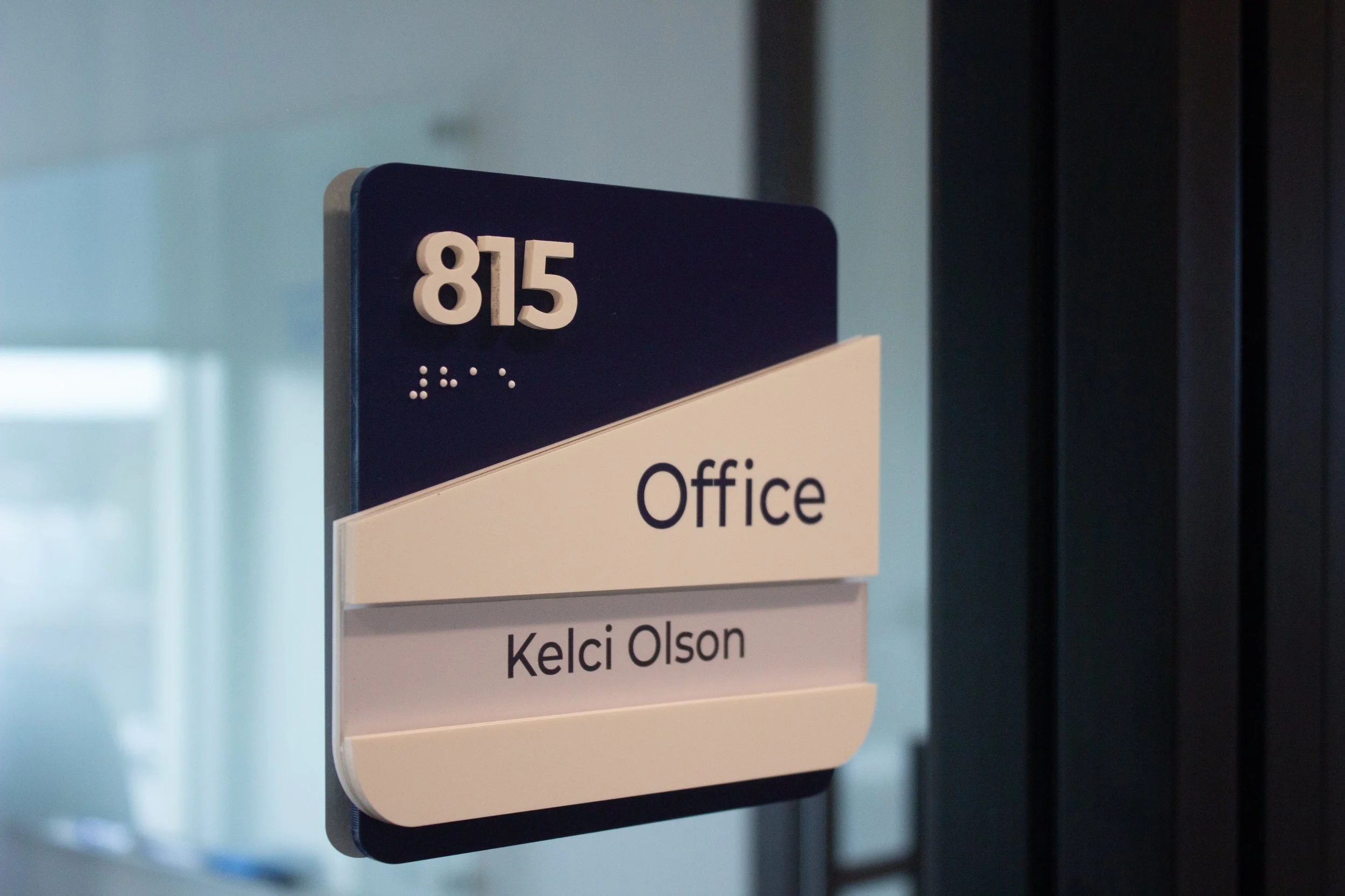
For APTIM, we designed a signage package that ties into their brand identity while adding clarity and cohesion to the space. The package included ADA signage with braille and raised characters, cubicle markers, and a clean, illuminated logo sign in the entry area.

Everything was designed to feel like an extension of their brand - simple, modern, and purposeful. Materials, colors, and type choices were all pulled from their visual language to create a system that feels right at home in their workspace. It’s signage that supports the function of the office while reinforcing who they are and what they do.